
The Net VR is an immersive 3D livestreaming platform that lets viewers move, interact, and socialize inside virtual theaters — making the live-streaming experience feel more human and connected, whether on a screen or in VR.
I’ll be highlighting my contributions, as this was a team project 🙂
My Role
As a UI/UX Designer, I’ve been responsible for designing Net VR Theater’s interfaces for beta testing, focusing on developing features that ensure a seamless experience for streamers and audiences to join, interact, and manage theaters on the desktop application.
problem
How do we define a brand identity, visual language, and UI structure that smoothly guides users into an unfamiliar 3D environment?
solution
My team and I developed a cohesive brand identity and UI system that guides users smoothly into an unfamiliar 3D environment. By defining an approachable visual language and clear interface hierarchy, we balanced immersion with clarity. Transitional 2D screens and minimal 3D overlays help orient users without disrupting flow, while monetization opportunities—like cosmetic upgrades and premium features—are integrated naturally along the journey.
Workflow
1
Research
Ideation
User Flows
Information Architecture
2
lofi-prototype
Defining Prototype Goals
Wireframing
Initial Prototyping
3
HIFI PROTOYPE
Style Guide
UI Design
Animation Prototyping
4
unity handoff
Documentation
User Testing
Implementation
PROBLEM + APPROACH
PRIORITIES
- Develop foundational design systems and flows that can support future features as the platform grows
- Make the experience feel inclusive and intuitive for users unfamiliar with VR or immersive tech
- Maintain brand cohesion and identity across interfaces
CONSTRAINTS
- Platform was pre-launch, with no formal user base to build from
- Little to no established design system or brand guidelines at the start
- Core app functionalities were still being defined during the design process
- Small UX team (3 junior designers) with no dedicated lead
How we Evaluated
- Frequent internal critiques within the UX team (1–2x weekly)
- Client feedback from the founder and co-executive shaped brand and tone alignment
- Adjustments made continuously to match their evolving product vision
What we Applied (Heuristics)
- Recognition over recall through visible labels and persistent navigation
- User control and freedom via clearly labeled exits and undo paths
- Flexibility and efficiency with shortcut paths and smart defaults
- Contextual help through strategically placed tooltips
- Real-world language (e.g., Store, Wallet, Theaters) to support intuitive understanding
UX Process
Design Methodology
Our team loosely followed the Double Diamond framework as a flexible guide to structure our approach for each new feature and design challenge.
Workflow
Operated within a lightly structured sprint system across the full team, updating a shared task board weekly.
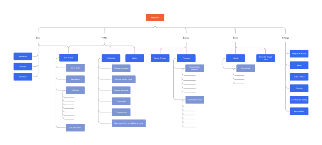
Information Architecture
Outlined the core navigation structure to ensure clarity and scalability as new features (like user profiles, merch, and social systems) were introduced. Also helped align the team and stakeholders around a shared vision for how users would move through the platform
User Flows
prototype goals
Establish Clear Design Vision
The prototype provided a tangible reference to keep developers and decision-makers aligned.
Test Usability
We assessed how intuitive the interactions felt and identified areas for improvement.
Refine UI Elements
We experimented with typography, colors, and layout to enhance the overall user experience.
Typography
Aa
Orbitron
Aa
Figtree
Aa
Jura
Heading Style
Heading 1
Heading 1, Orbitron, Bold, 40px
Heading 2
Heading 2, Jura, Bold, 36px
Heading 3
Heading 3, Jura, SemiBold, 36px
Heading 4
Heading 4, Jura, Medium, 36px
BODY Style
Body Style 1
Body Style 1, Figtree, Medium, 16px
Body Style 2
Body Style 2, Figtree, Medium, 24px
Body Style 3
Body Style 3, Figtree, Medium, 12px
other Style
Accent Style 1
Body Style 1, Figtree, Bold, 16px
Hyperlink Style 1
Body Style 1, Figtree, Medium, 16px, Underlined
Colors
Optimized for Dark Mode
primary
Bluetiful
#3669ED
Weezy Blue
#3698D0
Cosmic
#243C83
neutrals
Darkest Gray
#232326
Dark Gray
#39393E
Gray
#8A8A92
Blue Gray
#8B959F
Light Gray
#B4C4CE
White
#E5EAF6
feedback
Success
#E5FF61
Warning
#F5A047
Danger
#EB3E68
ICON set
Filled and unfilled.
UI components
Buttons
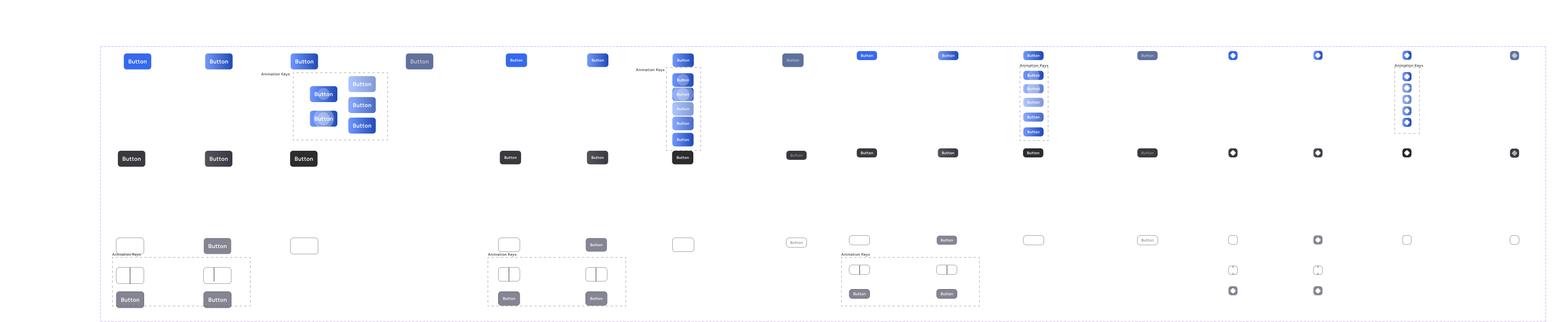
inputs
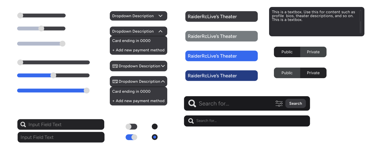
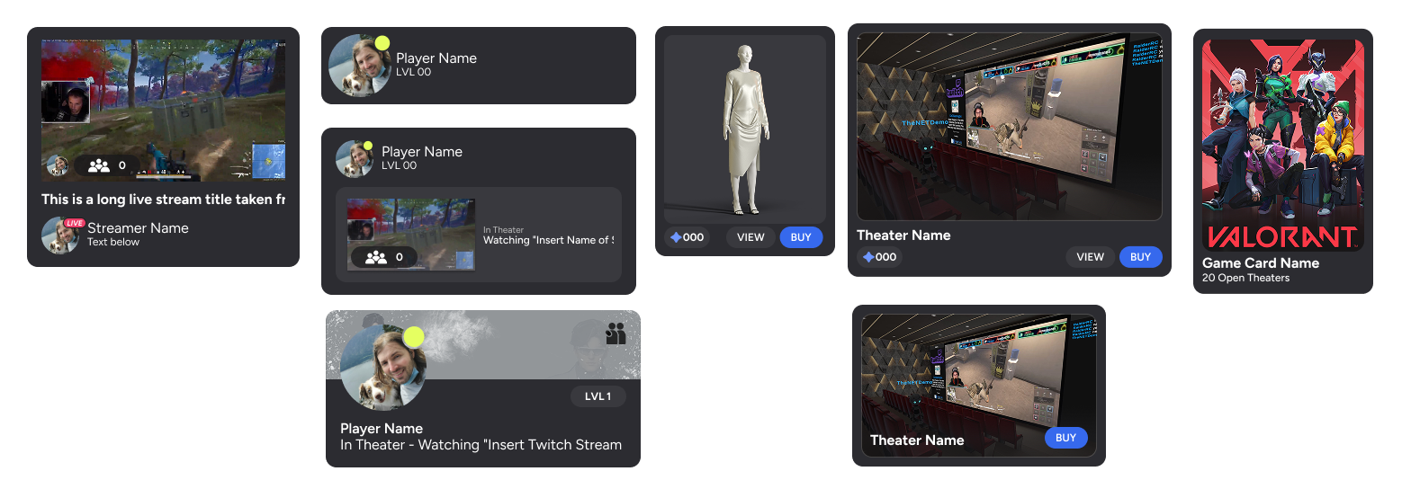
card components
final product
sign in page
User sign in with guest access to the application.
onboarding
Signing up for Net VR can take as little as 2 minutes while remaining transparent through each step along the way.
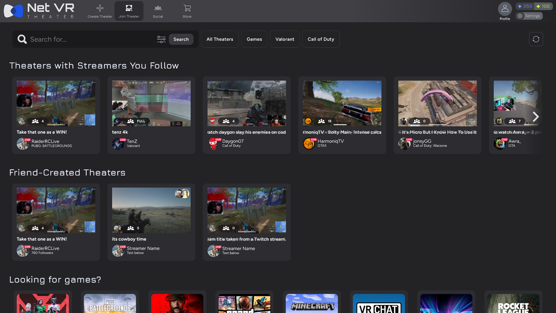
browse theaters
Finding a theater is intuitive, with a familiar layout inspired by popular streaming apps like Netflix and Hulu. You can search by name, streamer, or game to jump right into the action.
create theater
Hosting a theater allows players full control over their stream-watching experience.
shop
Buying clothes for your avatar is seamless and intuitive, combining the familiarity of online shopping with the customization of RPGs
Impact & Achievements
Enabled Revenue Generation
Implemented shop processes, allowing the company to start cash flow with the game.
Strengthened Team Leadership
Acted as an unofficial lead, improving organization and helping the team meet project deadlines.
Enhanced Brand Consistency
Updated and organized branding materials for a more cohesive identity.