Koala Forex is a website I designed to showcase accessible, AI-powered trading through Liberty, an AI bot for beginners. Beyond the tool, the site tells the story of the creator’s motivation and mission. My goal was to build a platform that educates, builds trust, and connects users to Liberty’s purpose.
As Web UX/UI Designer at Gaia Nación, I handled the full design process for Koala Forex, from discovery to final UI. I also created the brand identity from scratch—including naming, logo, colors, and typography—working closely with the founder to ensure the site felt trustworthy, approachable, and aligned with the his mission.
problem
Forex trading can be confusing and intimidating for beginners. Many users struggle to find trustworthy tools and clear guidance. At the same time, the AI trading bot’s creator needed a way to share his story and mission, so users could connect with the product on a personal level.
solution
I branded and designed the Koala Forex website to highlight its accessibility and ease of use. The site clearly communicates that Liberty, the AI trading bot, is free and user-friendly, no prior forex knowledge required. By combining approachable design with storytelling, I created a welcoming space where beginners can learn and start trading with confidence.
Project workflow
1
research
Competitive Analysis
Industry Trends
2
Branding
Visual Identity
Logo Design
Branding Materials
3
Design
Site Mapping
Responsive Layouts
Spline Interactions
4
BUILD
Webflow to Git
Bug Smashing
Site Testing
research
I audited six leading forex bots and saw a gap between overly technical and too-simple platforms. Combined with fintech design trends, it was clear users want tools that feel both approachable and professional—exactly what the founder envisioned. This guided a design balancing bold, friendly visuals with a credible, expert tone.
Competitive audit
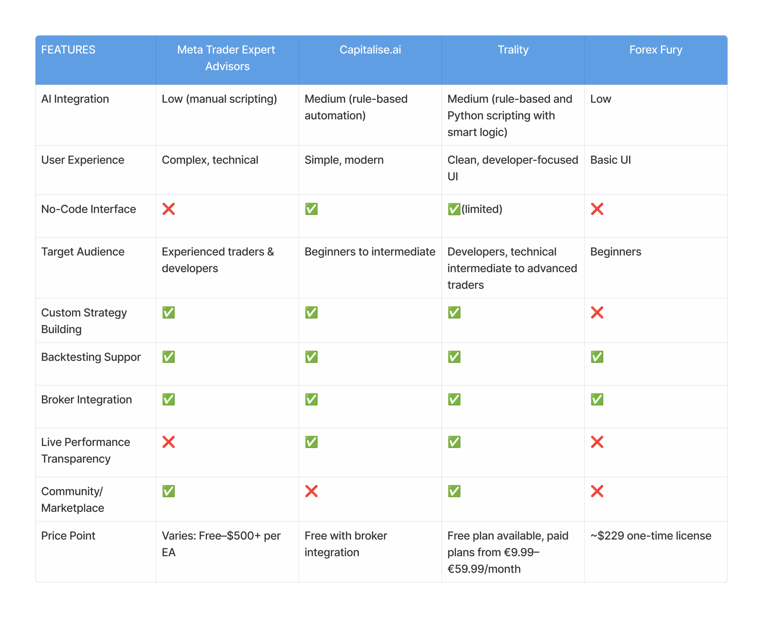
To better position our AI trading bot in the saturated forex market, I conducted a competitive audit of six leading platforms: Capitalise.ai, MetaTrader EAs, Forex Fury, and Trality.
Most competitors either target experienced traders with highly technical tools or offer beginner-friendly solutions that lack transparency, adaptability, or modern design. A recurring theme across the industry is outdated UX and conservative branding—often relying heavily on blue palettes and dense financial jargon.
From this audit, I identified a clear opportunity:
A bold, user-friendly AI bot that offers real-time adaptability, no-code automation, and transparent performance tracking.
A modern, approachable brand identity that breaks away from legacy finance aesthetics.
A clear focus on trust, education, and accessibility, especially for newer traders entering the space.
These insights directly informed our design choices—from branding and color palette to interface design and feature prioritization.
Industry Trends
During my research, I noticed that most forex and AI trading platforms rely heavily on conservative design conventions—muted blues, dense dashboards, and technical language. This creates a visual landscape that feels exclusive and intimidating to newcomers.
Emerging design trends in fintech and SaaS suggest a shift toward:
Bolder color palettes to improve brand recall and differentiate from competitors
Soft, rounded UI elements to create a more welcoming, modern feel
Simplified interfaces that balance data-rich visuals with accessibility
Microinteractions and animations to enhance clarity and user engagement
These trends guided my decision to design a brand that feels tech-forward, trustworthy, and approachable, especially for users who are curious but cautious about forex automation.
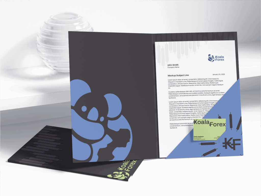
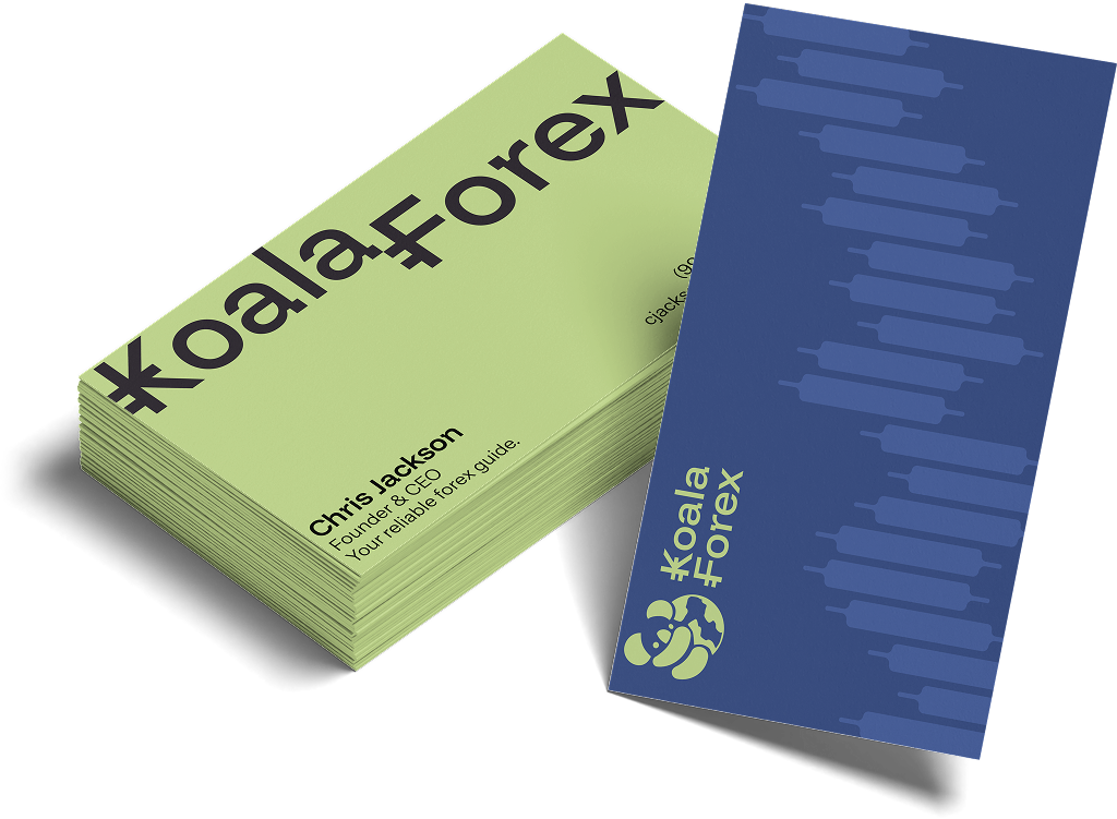
branding
I worked closely with the founder to craft a brand identity that felt both approachable and professional—reflecting the spirit of Koala Forex. He wanted something simple yet recognizable, and together we created a look that aligned with his vision for making AI-driven trading more accessible.
logos
The koala in the logo pays homage to the founder’s Australian heritage—a personal touch he felt strongly about including. To reflect the professional nature of foreign exchange trading, I selected typefaces that subtly resemble currency symbols, creating a cohesive link between the brand’s identity and its industry.
typography
Primary Font
Secondary Font
Instrument Sans
Colors
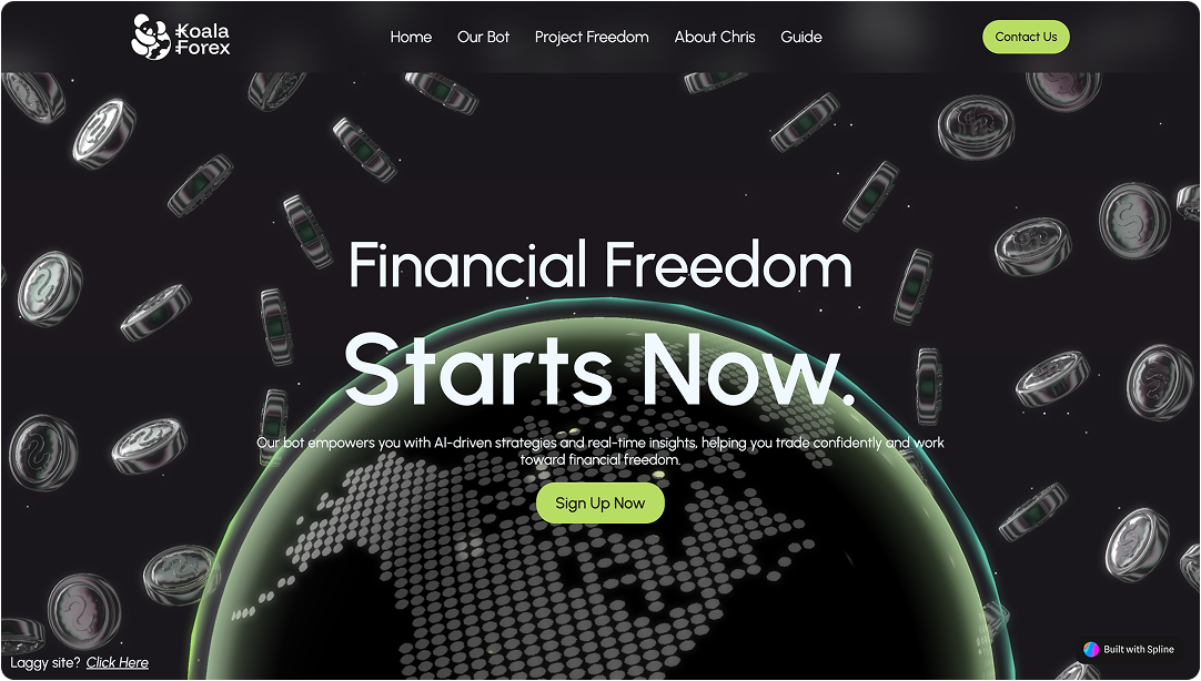
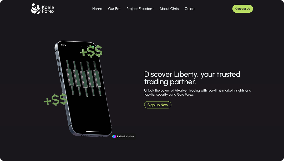
As a tech company, it felt appropriate to choose bold, distinctive colors that break away from the sea of blue-dominated forex brands. This palette not only helps the brand stand out but also creates a more approachable and modern impression.
Tory Blue
#364C84
Pancotto Pugliese
#C2D98D
Black Onyx
#2A252C
Bodega Bay
#6181BF
branding materials
design + implementation
As a static site, Koala Forex required creative visual design choices to keep things engaging without interactive features. With most competitors using dated, rigid layouts, I found it easy to stand out by embracing modern design trends—like bold colors, clean layouts, and approachable typography. This helped the brand feel friendly and unique, while still maintaining the professional tone the founder envisioned.
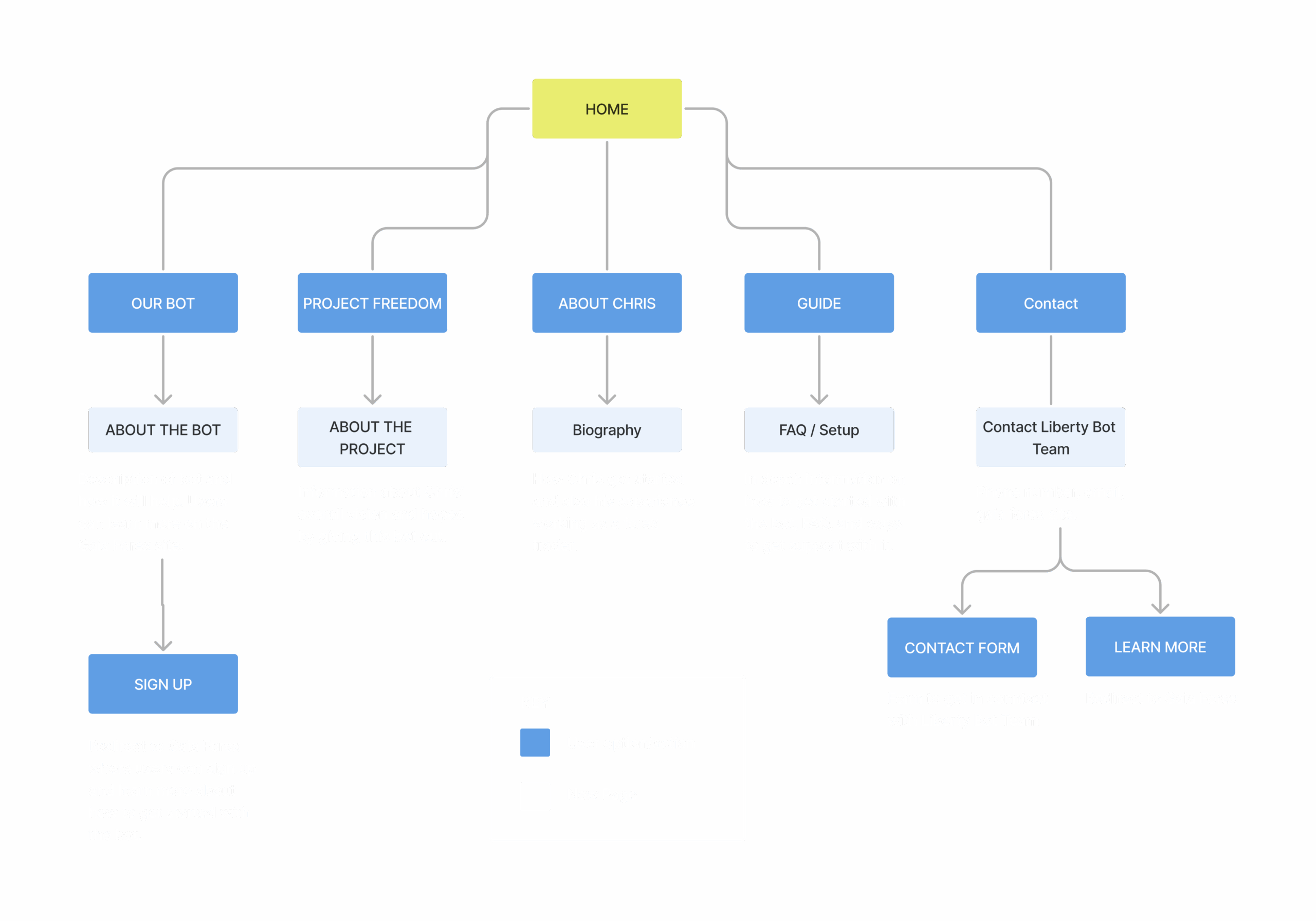
SiteMap
To ensure alignment across the team—including the founder, partners at Gaia Forex, and developers—I created a sitemap early in the process. It provided a clear visual of the site’s structure, helping everyone stay on the same page about content flow, page hierarchy, and navigation. This reduced confusion, streamlined feedback, and made it super simple to add/remove pages and features before developing in Webflow.
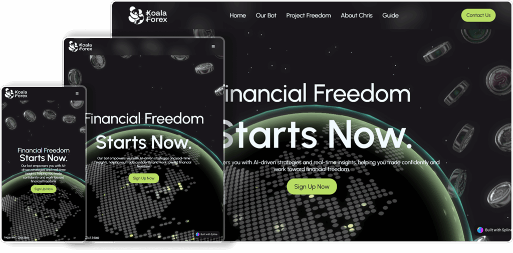
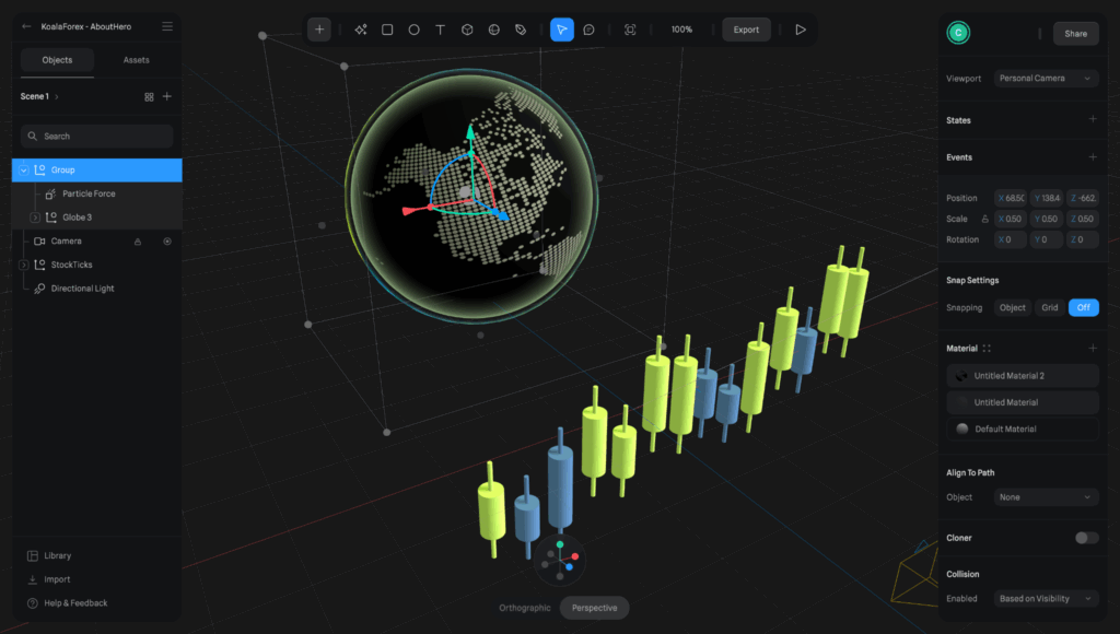
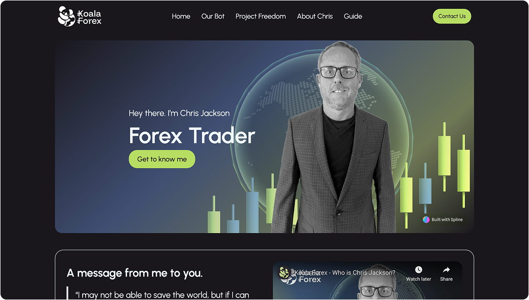
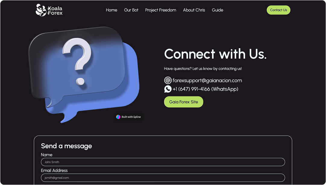
3d Design
To give Koala Forex a modern, standout look, I integrated custom 3D elements using Spline and Webflow. The interactive globe and stock visuals added motion and depth, helping the site feel more dynamic and tech-forward. Spline’s Webflow integration fit seamlessly into my responsive design flow—it allowed me to resize and reposition objects based on viewport size, keeping the experience polished across devices.
responsive design
With a broad audience in mind, I designed Koala Forex to adapt smoothly across screen sizes. Each section was built with flexible layouts, ensuring the site stayed clean, readable, and visually balanced—from desktop monitors to mobile devices.